 Arianne Albert is the Biostatistician for the Women’s Health Research Institute
at the British Columbia Women’s Hospital and Health Centre. She earned a
PhD from the University of British Columbia under the tutelage of Dolph
Schluter before branching off into health research. Arianne currently
has her fingers in all kinds of research pies, including work on the
vaginal microbiome. She still has a soft spot for sticklebacks though.
You can find her on LinkedIn and Google Scholar.
Arianne Albert is the Biostatistician for the Women’s Health Research Institute
at the British Columbia Women’s Hospital and Health Centre. She earned a
PhD from the University of British Columbia under the tutelage of Dolph
Schluter before branching off into health research. Arianne currently
has her fingers in all kinds of research pies, including work on the
vaginal microbiome. She still has a soft spot for sticklebacks though.
You can find her on LinkedIn and Google Scholar.
Heatmaps are incredibly useful for the visual display of microarray
data or data from high-trhoughput sequencing studies such as microbiome
analysis. Basically, they are false colour images where cells in the
matrix with high relative values are coloured differently from those
with low relative values. Heatmaps can range from very simple blocks of
colour with lists along 2 sides, or they can include information about
hierarchical clustering, and/or values of other covariates of interest.
Fortunately, R provides lots of options for constructing and annotating
heatmaps.
R preliminaries
Load libraries
The first step is to make sure you’ve got the right libraries loaded.
I find that the heatmap function in the basic stats package (loaded by
default) is quite useful for many applications. However, more
complicated annotations require either gplots or Heatplus (from
Bioconductor).
2 | source("http://bioconductor.org/biocLite.R") |
Get and Prepare Dataset
Next, we need some data! For this example, I’m going to use some microbiome data
available for download from Dryad, originally from the paper:
Boucias DG, Cai Y, Sun Y, Lietze V, Sen R, Raychoudhury R, Scharf ME.
2013. The hindgut-lumen prokaryotic microbiota of the
lignocellulose-degrading termite
Reticulitermes flavipes and its responses to dietary lignocellulose composition.
Molecular Ecology 22(7): 1836–1853. doi:
10.1111/mec.12230; Dryad data package doi:
10.5061/dryad.b922k.
This file is not formatted in a way that R will understand, so it
requires some alteration before importing. The file has samples across
the top and genera along the rows as well as some lovely, but
superfluous, summary annotation. I got rid of extra rows and columns and
transposed the rest in Excel. Now the 238 genera are along the top with
the 12 samples as the rows.
Load your data! I’m assuuming you know how to do this in R …
1 | all.data <- read.csv("genera example.csv") |
Here are the first 3 rows and 4 columns to give you an idea of what the data should look like:
2 | sample Acetivibrio Acetobacter Achromobacter |
We’ll have to strip off the sample ids and convert them to row names so that the data matrix contains only sequence count data.
1 | row.names(all.data) <- all.data$sample |
2 | all.data <- all.data[, -1] |
Now, to make a heatmap with microbiome sequencing data, we ought to
first transform the raw counts of reads to proportions within a sample:
1 | data.prop <- all.data/rowSums(all.data) |
3 | Acetivibrio Acetobacter Achromobacter |
4 | S7 0.000e+00 0.0004289 0.000e+00 |
5 | S8 9.625e-05 0.0000000 9.625e-05 |
6 | S9 0.000e+00 0.0002759 9.195e-05 |
Make heatmaps
Generally, the default colours for heatmaps are pretty appalling. I
personally like this palette, but play around to see what suits you.
2 | scaleyellowred <- colorRampPalette(c("lightyellow", "red"), space = "rgb")(100) |
The most basic of heatmaps:
1 | heatmap(as.matrix(data.prop), Rowv = NA, Colv = NA, col = scaleyellowred) |
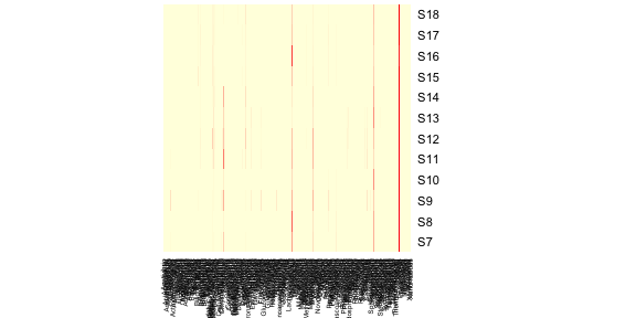
It’s pretty clear that this plot is inadequate in many ways. For one,
the genus labels are all squished along the bottom and impossible to
read. One solution to this problem is to remove genera that are
exceedingly rare from this figure. Let’s try removing genera whose
relative read abundance is less than 1% of at least 1 sample.
2 | maxab <- apply(data.prop, 2, max) |
4 | Acetivibrio Acetobacter Achromobacter Acidaminococcus |
5 | 1.088e-04 5.972e-04 5.441e-04 8.578e-05 |
2 | n1 <- names(which(maxab < 0.01)) |
3 | data.prop.1 <- data.prop[, -which(names(data.prop) %in% n1)] |
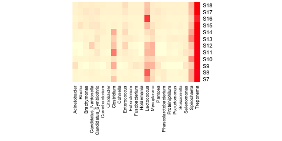
This leaves us with 23 genera suggesting that most of the taxa
sampled occur at very low relative abundances. The heatmap with the new
data looks like this, with a bit of extra fiddling to get all of the
labels displayed.
2 | heatmap(as.matrix(data.prop.1), Rowv = NA, Colv = NA, col = scaleyellowred, margins = c(10, 2)) |
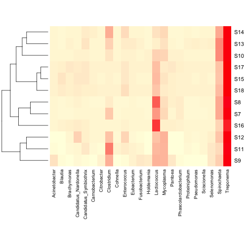
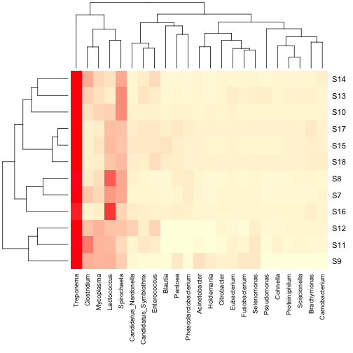
Much better! Now let’s add a dendrogram for the samples. The heatmap
function will do this for you, but I prefer to make my own using the
vegan package as it has more options for distance metrics. Also, this
means that you can do hierarchical clustering using the full dataset,
but only display the more abundant taxa in the heatmap.
2 | data.dist <- vegdist(data.prop, method = "bray") |
2 | row.clus <- hclust(data.dist, "aver") |
2 | heatmap(as.matrix(data.prop.1), Rowv = as.dendrogram(row.clus), Colv = NA, col = scaleyellowred, margins = c(10, 3)) |
You can also add a column dendrogram to cluster the genera that occur
more often together. Note that this one must be done on the same
dataset that is used in the Heatmap (i.e. reduced number of genera).
2 | data.dist.g <- vegdist(t(data.prop.1), method = "bray") |
3 | col.clus <- hclust(data.dist.g, "aver") |
2 | heatmap(as.matrix(data.prop.1), Rowv = as.dendrogram(row.clus), Colv = as.dendrogram(col.clus), col = scaleyellowred, margins = c(10, 3)) |
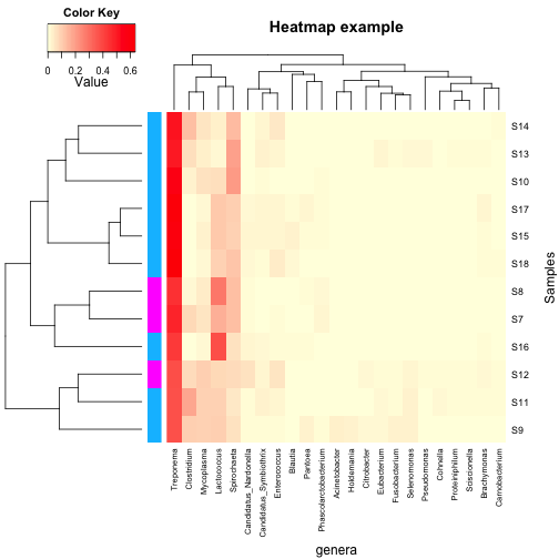
For some applications, the above heatmaps would be sufficient,
however, there are many times where it would be nice to indicate on the
heatmap values for other important variables, such as experimental
groups, or values of covariates. Also, it would be nice to have a legend
for the colour scale. heatmap.2 in the gplots package can do both of
these things.
First, let’s make up some annotation for our dataset (I would like to
be 100% clear that this is totally fictional data and not in the
original publication in any way):
2 | var1 <- round(runif(n = 12, min = 1, max = 2)) |
2 | var1 <- replace(var1, which(var1 == 1), "deepskyblue") |
3 | var1 <- replace(var1, which(var1 == 2), "magenta") |
2 | cbind(row.names(data.prop), var1) |
Next, we can make a more complicated heatmap.
1 | heatmap.2(as.matrix(data.prop.1),Rowv = as.dendrogram(row.clus), Colv = as.dendrogram(col.clus), col = scaleyellowred, RowSideColors = var1, |

You’ll note that some of the defaults for heatmap.2 are kind of funny
looking. The green tracing in each column can be turned off with
trace = "none", and the histogram in the scale legend can be removed with
density.info = "none". You can add plot labels (e.g.
main,
xlab and
ylab), as well as change the relative sizing of the plot elements (
lhei and
lwid). There are lots of other options which are surprisingly well described in the help for
heatmap.2.
1 | heatmap.2(as.matrix(data.prop.1), Rowv = as.dendrogram(row.clus), Colv = as.dendrogram(col.clus), col = scaleyellowred, RowSideColors = var1, margins = c(11, 5), trace = "none", density.info = "none", xlab = "genera", ylab = "Samples", main = "Heatmap example", lhei = c(2, 8)) |
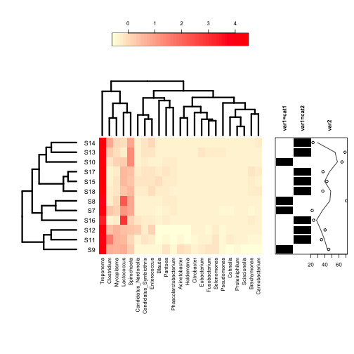
Finally, the least intuitive function is annHeatmap2 from the
Heatplus package. However, it allows for annotation with multiple
variables at once, as well as an option for colouring the dendrogram
into clusters. All of the options within the function are written as
lists, which can take some getting used to if you don’t use them
regularly.
2 | plot(annHeatmap2(as.matrix(data.prop.1), |
2 | col = colorRampPalette(c("lightyellow", "red"), space = "rgb")(51), breaks = 50, |
2 | dendrogram = list(Row = list(dendro = as.dendrogram(row.clus)), Col = list(dendro = as.dendrogram(col.clus))), legend = 3, |
3 | labels = list(Col = list(nrow = 12)) |

Annotations are added with the ann sublist which takes a data frame
as its input. Unlike the other functions, it can take multiple variables
for annotation including continuous variables.
2 | ann.dat <- data.frame(var1 = c(rep("cat1", 4), rep("cat2", 8)), var2 = rnorm(12, mean = 50, sd = 20)) |
1 | plot(annHeatmap2(as.matrix(data.prop.1), col = colorRampPalette(c("lightyellow", "red"), space = "rgb")(51), breaks = 50, dendrogram = list(Row = list(dendro = as.dendrogram(row.clus)), Col = list(dendro = as.dendrogram(col.clus))), legend = 3, labels = list(Col = list(nrow = 12)), ann = list(Row = list(data = ann.dat)))) |
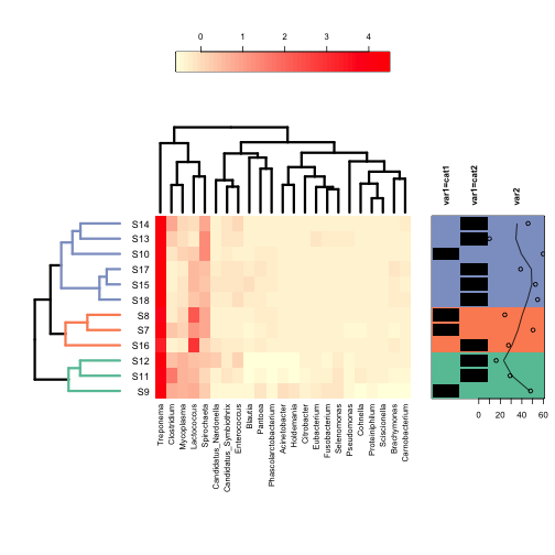
Finally, clusters in the dedrogram(s) can be highlighted using different colours with the cluster sublist:
2 | ann.dat <- data.frame(var1 = c(rep("cat1", 4), rep("cat2", 8)), var2 = rnorm(12, mean = 50, sd = 20)) |
1 | plot(annHeatmap2(as.matrix(data.prop.1), |
2 | col = colorRampPalette(c("lightyellow", "red"), space = "rgb")(51), |
4 | dendrogram = list(Row = list(dendro = as.dendrogram(row.clus)), Col = list(dendro = as.dendrogram(col.clus))), |
6 | labels = list(Col = list(nrow = 12)), |
7 | ann = list(Row = list(data = ann.dat)), |
8 | cluster = list(Row = list(cuth = 0.25, col = brewer.pal(3, "Set2"))) |
This is just a taste of what these functions can do. Experimenting
with changing the default values and seeing what happens is half the fun
with R.